Visual Identity for a
brand that works in juxtapositions
Brand Design
Visual Design
Visual Strategy
Duration: Oct - December 2025
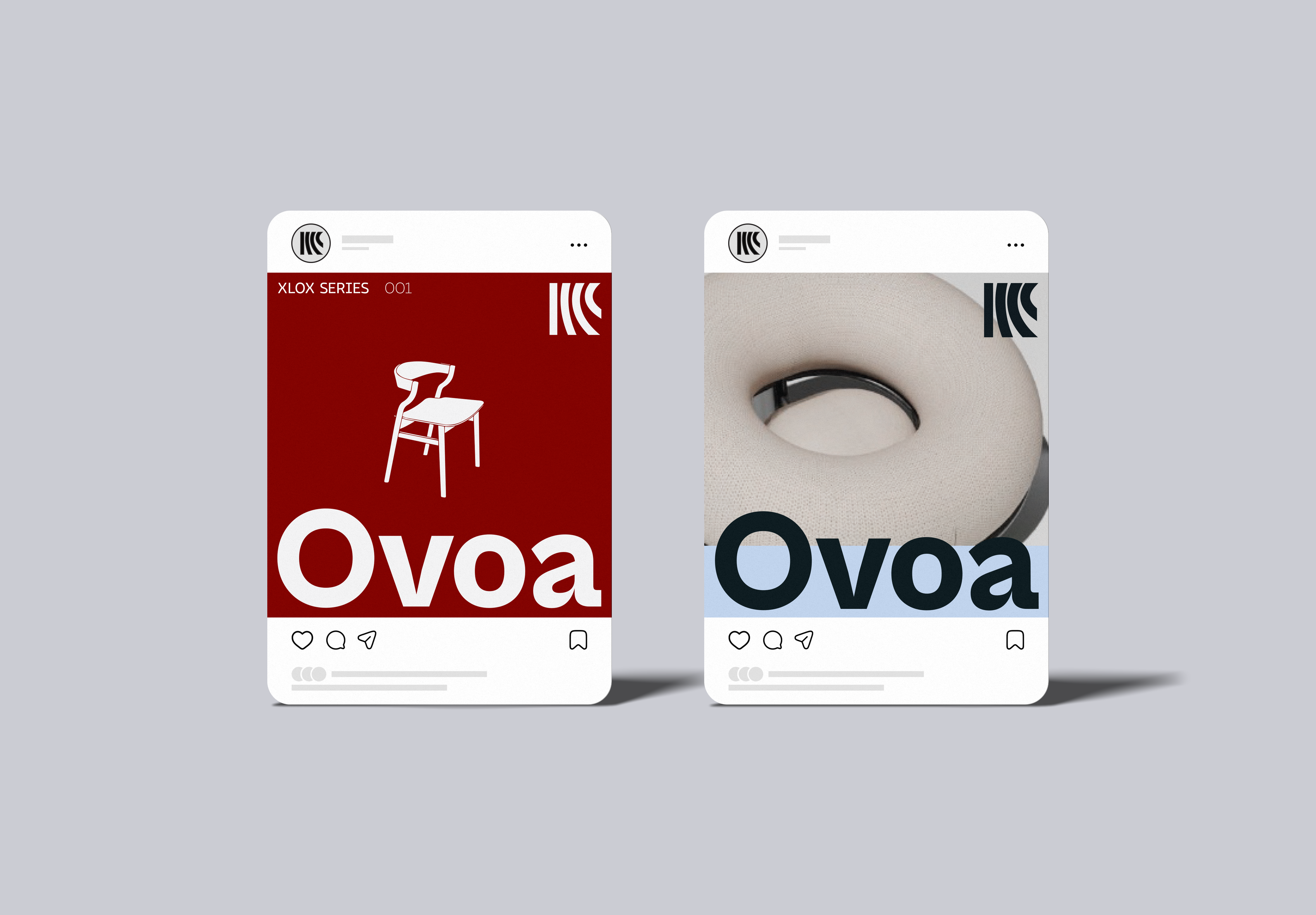
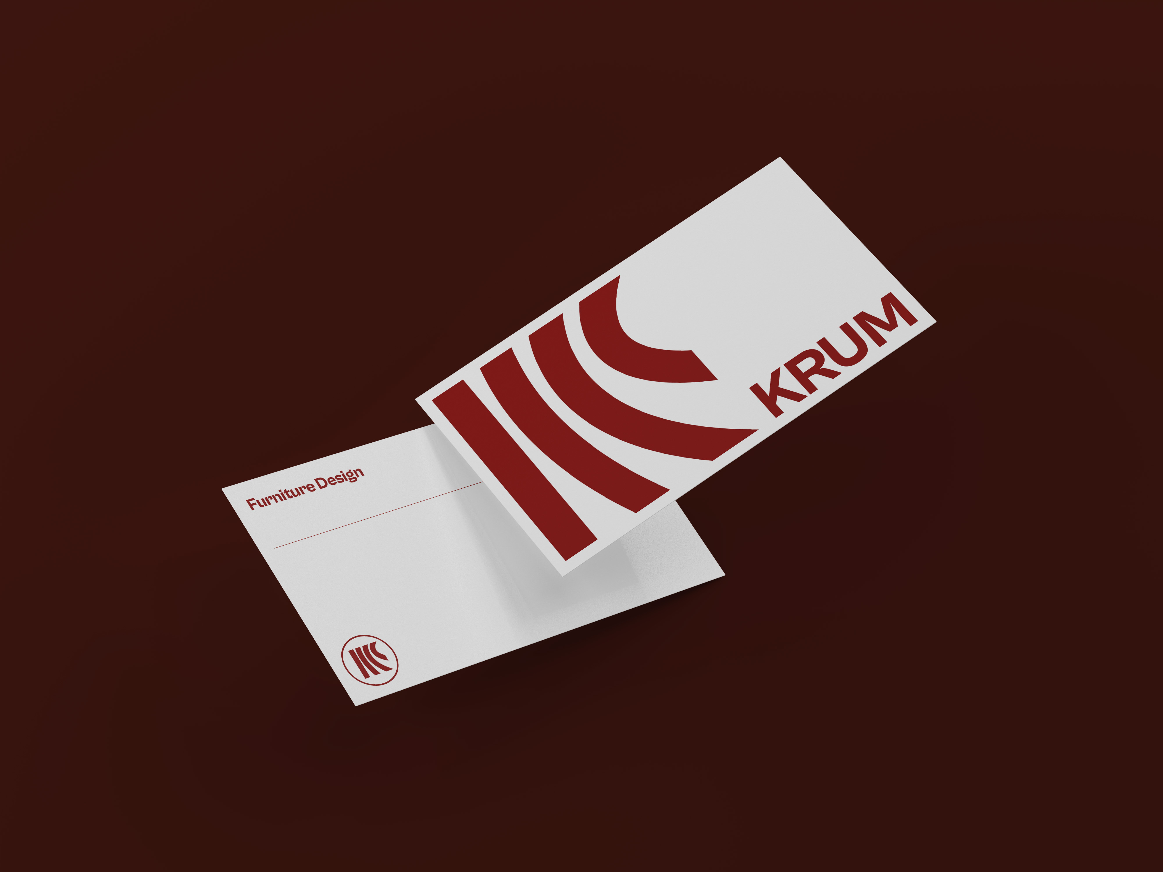
The visual identity and strategy of Krum is a reflection of the juxtaposition that the brand sits in. The idea behind the logomark was to create a visual symbol that captures contrast, playfulness and at the same time feels niche and speaks luxury.
With the vision to reimagine and recreate indian crafts with a fresh contemporary perspective, the logotype invites open interpretation, it can be seen as a gradation from rigid to flexible, or as a peeking eye capturing the cultural shifts that Krum envisions for or a wordplay of K & O.